If you are a business, either a startup or an SME, gaining success or even a well-established one, you know the worth of a logo, what it means, and what it can convey, and there are elements in a logo design that do this. Some of the main ones are typography, the type (you choose), and, most importantly, its shape, which gives meaning to your brand and helps convey a message to the audience.
But among all these, logo shapes play a very big role. They exist in multiple ways and psychologically impact viewers’ feelings.
The association between a brand and a particular shape can, at a very great level, influence people’s sensitivities, mentality, and thoughts about your brand. Rarely do we realise that shapes like circles, triangles, or rectangles carry inherent meanings. When we encounter signs of these shapes, our minds tend to form specific impressions.
Call our logo design company in the UK for the most ideal logo launch as you imagined. We currently serve hundreds of clients, and you can be one of them with just a call and a free session with us.
So, let’s learn more about logo shapes before examining their meaning and relationship with brands.
What is a shape (We know you know, but…)?
We can always find shapes from the smallest to the most prominent objects. Despite that, you need some more clarification on what it is.
In geometry, the outline of a product is named a shape. An object’s outline is its periphery or it’s external. The form is thus a depiction of a configuration that is the outcome of assembling lines. Yet, the lines are joined in a particular manner to build the periphery of a product or a human figure.
Shapes are a potent medium for creatively expressing ideas in design and the arts. A two-dimensional space is the artistic definition of a shape, which indicates that lines are not always necessary to create forms. Shapes can also be formed by utilising color and value, namely dark and light, to create the illusion of shadows, making an object seem three-dimensional.
Picking the accurate shape definition is essential when working with a custom logo design service to accomplish your desired clarity and brand messaging. It will help build an emotional linkage, especially with a specific demographic.
It is all about Logo Shapes and the Meanings they can convey
Have you ever noticed how different companies (international and local) have unique icons that represent their business? These icons help the audience recognise the company and what it offers. But did you know that each symbol has its shape, writing style, and colors?
Just like colors have meanings, shapes carry out too. When companies desire to build their brand’s symbol, they work with designers to pick a shape that matches their message. They pick a shape that matches what they desire to say about their company. Even when using digital logo makers, companies can understand the particular meanings joined with shapes before building their picking. Shapes, much like colors, carry inherent connotations that can influence perception.
Circular shapes invoke notions of stability, femininity, and unity. They built a sense of community and friendship. Triangular shapes, conversely, exude strength, masculinity, and accuracy, frequently associated with law and science. Square shapes carry proficiency, strong suit, and efficacy. You can embody a sense of sturdiness and trustworthiness.
Vertical lines are often linked with masculinity, aggression, and progress. They shows strength and stability. On the other hand, horizontal lines revolves around peacefulness, calmness. A sense of speed these lines shows with a strong community build-up and interconnectedness vibe. Each element of a business logo is cautiously curated in alignment with the intended onlookers for brand recognition.
Here are multiple shapes (All You are familiar with) used in a logo design, along with their interpretations:
Rectangle and square logos — a sense of balance and constancy

Square and rectangle shapes are stable and balanced. These shapes work for as persuasive icons for brands in the hunt for steadfastness. By using these shapes in a logo, any firm can signal viewers that it prioritises their well-being, instilling strong confidence in its products or services.
Despite their ubiquity, these shapes remain popular among creative minds. They use them to maintain relevance in design trendily.
Take, for example, the iconic Ritter sports logo, which cleverly reflects the shape of its chocolate bars. The brand toughens its devotion to solidity with a square container-like emblem.
Circle logos — harmony and wholeness

Circular shapes have long been an expert choice in logo design. Their completeness, security, and continuity connotations is the reason. The soft, rounded appearance of circles is aesthetically gratifying to the eye.
A good example of circular representation is in the Olympic logo. An iconic emblem that shows unity. This circular symbol stand for the togetherness and community making central to a global sports get-togethers with overlapping circles—a solid depiction of interconnectedness and solidarity.
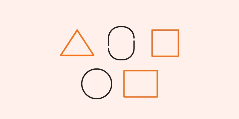
Triangle logos — vibrant and mystic
![]()
Triangle shapes are less common in logo designs, but they give brand marks a mystique and a rareness. Graphic designers can infuse playfulness with this shape and firmly position brands exclusively in their markets.
The upward-pointing triangle in Mitsubishi Motors’ logo symbolises progress and modernity, while its grounded points signify stability.
The logo’s rotating ability suggests the brand’s dynamism and movement. For example, Adidas’ logo, featuring three thick diagonal lines forming a triangle, evokes speed and motion, which is apt for a sports brand. When asked about the meaning of the Adidas logo, one can state speed and motion.
Vertical and Horizontal logo shapes — bravery and headway
Horizontal and vertical ones, help show what a brand is about inventively. Creative people can use these shapes to make you feel and understand many things.
Horizontal lines are all about speed. However, it conveys community buildup with calmness. Expansiveness and tranquility are also coveys in a logo’s design. The IBM logo is a prime design for using horizontal shapes. The letters IBM have multiple horizontal lines (4 straight and two diagonal lines, making “v”). The logo shows the brand’s identity with clearness and simplicity.
Conversely, vertical lines, frequently associated with courage, growth, domination, and forte, strategically lead the viewer’s gaze and imbue a sense of supervision.
Similarly, Spotify’s logo uses horizontal lines to express connectivity. This is ideal given the company’s role as a music-listening platform that promotes a sense of harmony and public experience among users.
Meanwhile, bumble, an app committed to allowing women in relationships, includes three horizontal lines in its logo design, representing trust and community-building within its consumer base.
Spiral/natural logo shapes — whimsical and molten
Organic shapes are known for their unique and natural forms. Anyone can recognise them with little effort. These shapes are inherently soothing to audiences and consumers. Like fire, trees, and flowers, they are free-flowing.
The “Patagonia logo “is a prime illustration of natural shapes in branding. It has a wordmark alongside a mountain; the logo’s natural mountain shapes imply natural beauty and adventure. The logo communicates the brand’s daring spirit.
Spiral shapes, with their spiraling effect, on the contrary, give out a fanciful and fluid essence. Brands like Somersby use soft spiral shapes evocative of tree foliage in their logos—a visually attractive and organically shaped brandmark is making life.
Wellness and food firms often incorporate these curvy shapes into their branding. They need to invoke a sense of natural genuineness and vitality.
Abstract logo shapes — adaptable and vivid
Abstract logos lack a precise, recognisable shape like any object. They challenge conventional forms and depend on the feelings of color, patterns, and ill-defined movements. These logos look 100% unique, and you can convey meaning to your different audiences using them in numerous ways.
Take the Starbucks logo, for example; its mermaid motif has historical importance, yet its abstract nature allows for multiple modern interpretations. Likewise, the Slack logo is multicolored and shapeless. This design encourages personal interpretation.
The Squarespace logo occurs with the letters,’ and retains abstract quality despite its origins. The logo welcomes audiences to tell the difference in their symbolism.
Likewise, the Tiktok logo, resembling a musical note, goes beyond its literal meaning to symbolise social connectivity.
Interestingly, specific abstract logo designs are more recognised than their simpler counterparts, proving the strength of ambiguity in design.
Valuable Advices to pick a logo shape
Now that you are aware about logo shapes types and their meanings, it would better to have actors to keep in mind when making a shape for your company logo. Here are specific beneficial tips:
Your brand has some values that give it a personality; always consider these
Before making a verdict, openly outline your brand ideals and conjure up how different shapes balance with them. Be confident that the shape you pick rings with your brand’s characteristics.
Your brand has a color, and you must balance your shape with it and brainstorm for it
Take into account your brand colors when selecting a logo shape. Colors invoke numerous feelings, so picking a shape that improves your brand’s color palette is major. Aligning the shape with your brand colors will help entice emphasis to your brand and build a memorable visual identity.
The fixed and must tactic is to search (and Research) about your rivals, the market, or the new entrance
Before your logo development, it’s a good idea to check out your competitors’, your market and the new entrance that can give new change to the world. Their logos and see what shapes they use. When you do this, you can develop a shape that is different from the rest. You can make your brand stick out. Imagine what shape best shows your brand’s personality and numerous aspects of your firm.
When designing your logo, you can opt for “Logo Designs Company” expertise. With us, you can cautiously select a logo that balances your brand values, colors, and sector trends, you can build a distinctive and influential visual identity for your organisation.
Giving the Finishing Touch
Exploring shapes is a major part of logo design. You now be familiar with that shapes transfer a brand’s persona and message well. You can consider circular, square, rectangular, triangular, abstract, spiral, and natural shapes. Yet, not all shapes are suitable for each brand; selecting the correct one depends on the desired message and sector.
Brainstorming is a must when you pick a shape, and the expert team of our logo design company can do that for you. This accurately reflects your brand’s identity and communicates its essence to the audience.
Also Read: Craft the most unique animated logo design