Around 99,000 searches per second or 5.9 million searches per minute, which equals 8.5 billion daily and 3.1 trillion searches worldwide yearly. With this, you can assume how many people can see the Google logo daily – 30 times.
Within these past decades, the Google logo has a history, beating Yahoo and Microsoft Bing logos due to its easily recognisable design, playful colours, and unique font.
But how did this logo design become such an iconic icon? We will delve into its logo history.
Google Logo History


Google was initially a search engine project named “Backrub” by two Stanford students, Larry Page, and Sergey Brin, in 1996. Their aim was to put all the world’s data on the Internet as easily as possible.
But the term “Backrub” seems very odd and soon changed.
After some polishing in the name and search engine algorithms, Google came to life in 1998. Its algorithm technique disrupted the whole internet industry, and Google took the lead in all aspects of solving user queries.
One more fun fact is that after “Backrub,” Google was named “Googol” but unintentionally misspelled, and Larry thought this name could be attractive to the audience. “A “Googol” is a mathematical word used for the number “1” with 100 zeros after it.
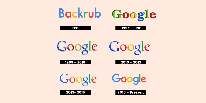
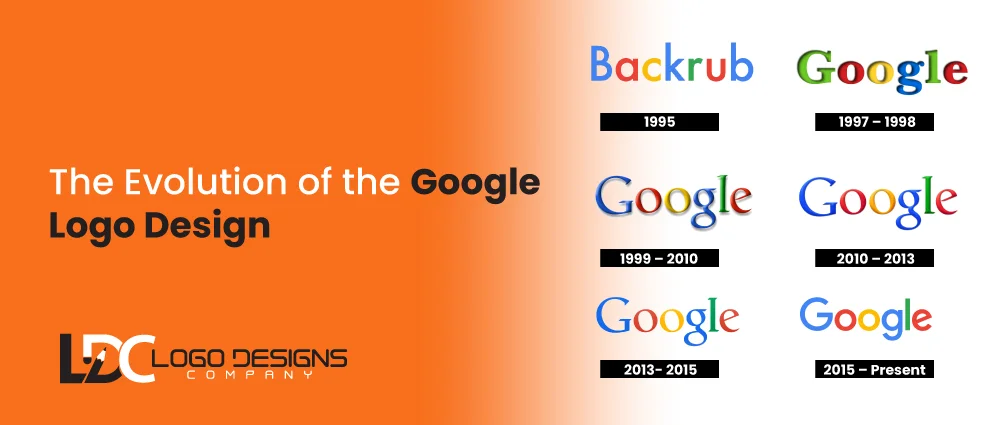
1997: The First Original Google Logo
The initial logo was simple. Sergey Brin designed it using free graphic design software. The logo has a vibe of old-fashioned word art, which was very famous at that time.
The logo’s Baskerville Bold typeface and simple, colourful lettering grab the audience’s attention. Google’s reason for choosing those colours is not revealed, but there are rumours that the logo was inspired by the Lego tower, which kept tech huge initial server.
This logo design was continued for only a few months.
1997 – 1998 – Google’s first official logo
In 1974, the Google team launched a new logo design. It is a classic 90s development. At the end of the logo is an exclamation mark, which is a bit of a copy of the Yahoo logo.
The logo has a serif font that provides a feeling of trust and authority. At that time, such are very famous.
Larry’s quote behind this font in a logo: – “If we are not trusted, we have no business.”
The logo didn’t lose its playful spirit. In fact, the team added more shadows to the logos, along with text that became more rounded. The first letter, “G,” was also changed from green to blue.
1999 – 2010 – The Classic era
In 1999, Google decided to include more playful sports in its logo. A famous designer, Ruth Kedar, is now responsible for developing a colourful, lively logo.
The new logo uses new typography called “Catull”—an angle axis, sharp serifs, and a modern look.
Ruth Kedar stated: “
Ultimately, we use the primary colours. We don’t go in a pattern of order. We focus on a secondary colour on the letter “L.” This shows that Google doesn’t follow rules.
Such bright and bold colours describe the Google logo for the next eras. The axis on the “e” on the right and the dual “o” slant on the left show the playfulness and Google’s importance towards innovation and creativity.
2010 – 2013 – The starter of a cleaner appearance
By 2010, Google was no longer a startup business. It has expanded its operations worldwide and has 25,000 employees active in over 100 nations.
No, Google needs to develop a simple logo design that shows its worldwide recognition in the world of giant internet.
So, Google decided to lower the shadows from the logo and mute the hues, which created a much smoother look.
The start point of a new era of Google’s modern design aggressively exposes the blunt progression of internet tech.
The new logo design also shows Google’s motivation to prioritise user experience and its movement toward a flat design, which is a smart strategy in the digital zone.
2013- 2015 – A focus on simplicity
Now comes the year 2013. Google again declares a new design with a more minimalistic approach than the previous ones. Now, there is no shadow effect, and the logo design is even more straightforward, with a flat look.
Type-Together Co-Founder named “Veronika Burian” stated that: –
“This time of logo updating is a very reasonable step that we have taken. The company must show that Google is now a globally recognised giant tech, not a startup. So we eliminate the fun-garage style by removing the 3D effect and shadows.”
The version shows how minimalism is the best way to demonstrate digital expertise in the land of digitalisation. Also, this flat logo design favours the mobile user, as simple and flat designs show up better on larger screens.
2015 – Till Now – current Google logo Birth
The 2015 Google logo is the most drastic revision in logo design. The logo does not represent changes in its design but exposes a complete rebranding of its giant tech firm with the launch of a parent firm called “Alphabet Inc.”
Google’s main designers regarding its logo and rebranding stated that: –
“Google at all times uses simplicity, friendliness, and accessible style in its logo. The company wishes to keep these traits. So we just mix mathematical purity of geometric forms with the childlike simplicity of schoolbook letter printing.” Jonathan Jarvis, Alex Cook, and Jonathan Leepull – Google’s main graphics designers
So, google eliminated the serif font for the first time and came up with a custom “Product Sans,” a geometric sans-serif typography.
The reason for choosing such a typeface is that sanserif fonts are crisp, modern, and easily readable on digital platforms, and they take the main stage compared to other fonts. Also, such fonts give Google flexibility and cohesiveness.
The sans-serif typefaces are highly adaptable. They maintain solid readability and can be adjusted for screen sizes and devices.
Even though a few people admire this logo version and mostly associate it with a fridge magnet or a Kid Discovery Zone,
But in actuality, it shows a playful and welcoming picture in a very mature style that echoes the brand character, which is the tech giant ruling the digital world.
The Google Doodles beginning


Doodles are images that Google creates to delight viewers during a webpage visit. Google Doodles have changed the way users interact with brands. In 1998, this idea started with a series of fun and quirky changes to the Google logo, which happened when both Google inventors attended the Burning Man Festival.
Have a look at the first Google Doodle:
This first quirky Google Doodle logo gave birth to Google Doodles. A Google Doodle appears on the webpage for every unsung hero, event, and anniversary. It associates and reminds us of important events that occurred in the past, present, and future.
It is just to evoke feelings of fin and inventiveness in the tech world.
Logo about Google’s ever-expanding space


The brand has maintained its reputation with a diverse range of goods, like Gmail and Google Docs. How does Google maintain its Google-ness? Via shape, colour, and clarity.
- Google Play: This logo features a distinctive triangle symbol in addition to the same colour scheme. One frequent method for decorating the icon with the colours of the Google logo is to overlay colours as blocks or stripes.
- Google Drive: Google Drive’s triangle logo has the recognisable Google colours. The three hues represent the Sheets, Docs, and Slides services Google Drive offers.
- Gmail: The logo incorporates an envelope icon with Google’s iconic colour scheme. It represents its main purpose as an electronic communication platform that can be relied upon..
- Google Maps: The Google Maps logo uses Google’s colour scheme in the shape of a location pin to convey the application’s purpose.
Google’s subsidiary logos all use the same colour scheme and level of minimalism. It guarantees brand identification while permitting differentiation even in the face of distinctive individual elements.
However, what does this all mean? As it expanded from a garage startup to the fifth-biggest firm in the world, how has Google brought everything together?
The impact of the Google logo through time
Thanks to Google, anyone with a Wi-Fi connection can now access information anywhere. The logo represents this purpose; it evolves gradually, never losing its sense of humour or user-centred philosophy.
The vivid hues demonstrate the company’s inventiveness and inventiveness. The logo’s simplicity emphasises Google’s dedication to accessible design.
2015 saw a shift in typeface preference from serif to sans-serif, emphasising readability and accessibility across all digital platforms. It reflected the company’s evolution from “just” a search engine to a full array of user offerings.
The Google logo is more than just a trademark; it is a visual representation of the company’s history and future goals.
So, in case you want a tech startup or SME, get our logo design services to build a simple and versatile logo. Contact us!


