In seeking development, audiences are constantly changing the way they imagine. As marketers, it’s our mission to benefit from these shifting mindsets, converting them into opportunities for our brands. Clients have potent feelings about brands, goods, and designs and frequently don’t even realise it. Only a few people are good at understanding these secret thoughts and the feelings they bring.
The history of the Nike logo proves how vital this is for brand managers, designers, and company owners alike. You need to understand their point of view and, in a sense, “step into their shoes” to leave an enduring effect on clients.
Creating a logo that connects takes a combination of the right colours, fonts, and general graphic aspects. When done adeptly, a logo design can rapidly and powerfully influence the client’s buying moments like a Nike sign does.
But where did this easy but powerful sign come from? What has it existed through the years? This article talks about the background, evolution, and meaning of the Nike logo and how it shows sports, performance, and cultural effects.
Contact Logo DesignsCompany for your branding needs. Have a free session with us.
The start of the $35 “swoosh”
A crucial moment unfolded in 1971, six years after Phil Knight commenced his journey towards making the Nike Empire. Knight, a former accounting professor who became an entrepreneur, noticed the talent of one of his students, Carolyn Davidson.
Despite her background in journalism, Davidson ventured into design after taking an elective course. Struggling financially, Knight gave her a freelance chance at his company, Blue Ribbon Sports.
As Knight was propelled towards establishing his footwear company, first targeting soccer and football players with a factory in Mexico, he sought Davidson’s deep know-how once more. Their vision for a logo that hinted at motion yet was clear-cut and effortlessly distinguishable from Adidas’ iconic three stripes led to the birth of the Nike emblem.
Throughout eight years of cooperation and evolution, the Nike logo design became the foundation of the brand’s visual identity. Nowadays, Nike commands more than 62% of the shoe market—a testament to the enduring legacy forged by Knight and Davidson’s partnership.
A vision changes into reality
The genesis of Nike’s nomenclature lies in a dream woven with the threads of inspiration. Jeff Johnson, one of Knight’s coworkers, saw the ghost of the Greek goddess Nike, the goddess of victory. Her existence was born not solely from the name but also from the symbolic “swoosh” that adorns Nike’s visage.
In ancient Greek stories, Nike was believed to be the spirit of victory. She inspired many warriors to achieve success in battle. Like the Nike “swoosh, “her wings bore the essence of inspiration and courage, pushing fighters toward their conquests.
Though lacking empirical evidence, experts guess that the crux of the goddess is reflected in Nike’s identity. From its name to the iconic “swoosh” and the rallying cry of “just do it,” echoes of Nike reverberate with the spirit of ancient divinity.
The creation of the “swoosh” symbol, thought up by designer Davidson, took shape through careful changes and improvements over time. Sketches upon tissue paper overlaid shoe designs, birthing a symbol of motion and dynamism. Amongst multiple choices, knight and BRS executives unanimously keep the “swoosh,” now a stubborn emblem of Nike’s ethos.
The birth of the “swoosh” required seventeen arduous hours and a paltry sum of $35. Knight’s initial reservations were eclipsed by the global adoption of the “swoosh,” a testament to its enduring appeal. Little did he forecast its meteoric increase to ubiquity, enthralling hearts across the globe?
Nike logo evolution


1964-1971


The original business visual identity featured three intertwined letters, “BRS,” with the wordmark positioned beneath it. Despite facing legibility hindrances, the blue ribbon sports logo design has a unique appearance with its distinctive stripes and shape.
1971-1978


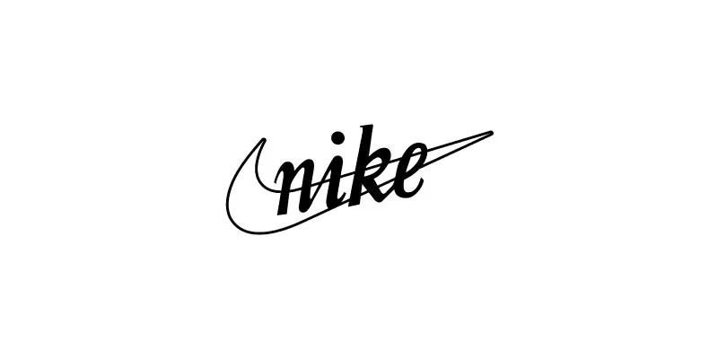
Debuting in 1971, the company underwent a name change, accompanied by a fresh visual identity. Immediately capturing the public, the iconic “swoosh” logo was emphasised.
Phil Knight suddenly acquired the logo. He is one of the business founders. Its designer, Carolyn Davidson, then a college student, made the emblem for a meagre fee. Little did she realise her formation would skyrocket to convert into one of the globe’s most renowned visual identities!
1978-1985


Nike underwent a logo redesign 1978, wherein the Swoosh was converted from a line drawing to a solid black checkmark. Simultaneously, the Nike wordmark underwent a revision from a cursive script to a Futura Bold font, which featured italicized, all-caps text.
The aesthetic of this redesigned logo is now more imposing and geometric. Significantly, the Swoosh’s tail and the tail of the final letter in ‘NIKE’ merged smoothly, resulting in a visually unified and dynamic effect.
Throughout the 1980s, the Nike Swoosh came to represent athletic prowess and performance on an international scale. Different color schemes and logo layouts were applied to make the name fit different product lines while keeping its primary shape.
1985-1995


A color metamorphosis was implemented in 1985 for Nike’s 1978 logo, which featured white lettering and a white Swoosh against a vibrant red background. The incorporation of this visually arresting color scheme enhanced the brand’s identity.
From 1988 onwards, this variant of the Nike logo was commonly associated with the brand’s recently introduced and presently renowned slogan, ‘Just Do It.’ This integration reinforced Nike’s brand identity on a global scale by fusing its instantly identifiable logo with an inspirational catchphrase.
1995-present


Through 1995, the Nike Swoosh attained pervasive recognition that enabled the organization to employ the emblem confidently without the corresponding wordmark.
Adopting a symbol-only logo, referred to as a brandmark or emblem, enabled a more comprehensive range of uses, specifically in incorporating or embroidering the design onto Nike footwear and apparel.
Implementing a symbol-only logo offered substantial benefits. The logo’s ability to overcome linguistic barriers and achieve universal recognition proved invaluable for Nike, a multinational corporation with a core value system that surpasses cultural and geographical boundaries.
Further, the utilization of a symbol exploits the innate reaction of the human brain towards visual stimuli, thereby cultivating a more profound affective bond with the brand. This transition towards branding that emphasizes images is consistent with the neurological principle that individuals frequently respond more instinctively and profoundly to visual stimuli than textual ones.
Nike logo design features
The Nike logo, renowned for its enduring minimalism and relevance, has withstood the test of time, becoming a quintessential illustration of how minimalism can wield the highest influence in design. Its sleek and simple design elements are perfectly harmonious. This logo design personifies the strength of minimalism.
- Shapes: – shape is a big part of our brains’ understanding of what we see. According to the study, geometric features in visual displays can make the audience experience things. Curved shapes often have linkages to delicate feelings. Inspired by the wings of the Greek goddess of victory, the shape of the Nike logo represents speed and brings about a feeling of positivity.
- Colour: – colour differences of the Nike “swoosh” logo, from classic black to lively red, orange, and green, have evolved over the years, each iteration combining deepness to the brand’s visual identity.
- Fonts: – fonts are merely as significant as shapes, colours, and icons when making a brand’s personality. Nike cautiously chose the geometric sans-serif Futura bold for its logo design, which flawlessly matches the brand’s general style. This font exudes energy and victory, flawlessly reflecting the business’s essence, values, and mission.
The Story Behind the Nike Logo: – It Wasn’t a Sudden Idea
The person who came up with the Nike logo design got a big gift, but it was delayed. The gift was a unique ring with the Nike logo, and they also got 500 parts from the Nike Company. But this wasn’t the final edition of the logo.
For Davidson, the logo depicted the goddess Nike’s wing, although shareholders initially sensed it resembled a ribbon. Yet, it’s now clear that the business associates the logo with their motto, interpreting it as a symbol of speed and energy. But it took some time for this point of view to fully take shape.
- Following BRS and the initial edition of the “swoosh,” the company implemented multiple delicate modifications to the logo. In 1971, Davidson’s “swoosh” design came to life with the company name in lowercase cursive letters.
- Continuing the evolution, by 1978, the company settled on a logo featuring a tick/”swoosh” beneath the company name in bold uppercase letters, conveying a sense of strength with increased geometric accuracy.
- Big edits were observed in 1985 when the logo was kept in a box, accompanied by a change in colour palette from black and white to red and white. Also, during the delayed 1980s, “Just Do It” created its debut.
- Returning to its original colours, the ones present in its logo, the firm introduced a simplified edition in 1995, with a lone “swoosh.” Here, speed and athleticism are shown in a more minimalist manner.
When Phil Knight talked about the history of the Nike logo, he reflected on the trip and stressed that the “swoosh” wasn’t merely an idea that came to him at the moment. This showed how cautiously it was formed.
Ten intriguing Nike facts you may know of
Here are ten captivating nuggets about Nike, shedding light on its extraordinary trip from humble beginnings to global prominence: –
1. The “swoosh” logo design initially left Nike’s co-founder Phil Knight underwhelmed, but he sooner or later warmed up to it, with its eventual iconic status.
2. Carolyn Davidson, the creative mind behind the “swoosh,” initially received a meagre $35 for her design but afterwards earned 500 shares of stock, now valued above $1 million.
3. Nike’s initial shoe featuring the “swoosh,” the ‘Nike Cortez’ in 1972, rapidly acquired acclaim, solidifying its status as an enduring icon.
4. Bill Bowerman, Nike’s co-founder, and a track coach, drew inspiration from his wife’s waffle iron to build a revolutionary tread pattern for operating shoes, birthing the legendary ‘waffle trainer’ in 1974.
5. Before settling on ‘Nike,’ the brand regarded names like ‘dimension six,’ finally picking ‘Nike’ for its connotations of victory and athleticism.
6. In 2017, Nike introduced the ambitious ‘breaking2’ project, aiming to shatter the two-hour marathon barrier, with Kenyan runner Eliud Kipchoge narrowly missing the mark wearing Nike’s innovative Zoom Vapour Fly Elite.
7. Nike’s dedication to eco-friendliness is evident through initiatives like the ‘reuse-a-shoe’ programme, introduced in 1993, converting legacy athletic shoes into new Nike products, considerably decreasing waste.
8. The Nike “swoosh” has risen above its athletic roots to become a cultural symbol, making appearances in numerous media forms and showing more than merely sporting dexterity.
9. Nike revolutionised customisation in 1999 with Nikeid, allowing clients to personalise their footwear with colour and material choices, setting a new norm in sports apparel.
10. Nike’s strategic sponsorship of athletes has been instrumental in its marketing achievement, beginning with Romanian tennis star Ilie Năstase in 1972 and extending to global icons like Michael Jordan and Serena Williams.
Conclusion
There’s no doubt that making a brand takes ideas and effort from your company. But it’s a myth that building a brand costs a lot of funds. This is specifically precise in this day and age. For illustration, Nike’s famous logo was created by a broke design student who needed a little extra cash.
The Nike “swoosh” shows more than athletic capability, creativity, and global culture. The iconic “swoosh,” which has helped Nike establish its legacy in branding history, raises and changes with the company.
How has your firm settled and reformed over time? Is now the perfect moment to imagine logo design?
Also Read: What are shapes in a logo design types and their meanings


