Imagine having a thousand words to express your company’s greatness; what would you say? Luckily, the characteristics of your logo already perform that every day. Now, the serious question is: What message do you wish your logo to convey?
Logos exhibit who you are, what you do, and how your business makes people feel. Colours, shapes, fonts, and other design characteristics can change people’s perceptions of your brand. When you accomplish it well, people can be instantly attracted to you.
Then, what is the proper approach to execute it? Our best logo design company in UK looks at the seven characteristics all great logos keep in common.
The Right shape
Graphic design is the art of visual communication. Designing a logo involves selecting visuals that effectively convey your desired message. Different images and even the shape of a logo can evoke specific emotions and feelings.
Each shape represents distinct characteristics, so matching your logo’s shape with the desired traits you want your brand to display is essential. In simpler terms, the shape of your logo can communicate specific qualities that align with your brand identity.
- Curvy lines: intriguing, Playful, relaxing,
- Squares and rectangles: trustworthiness, Efficiency, security
- Circles and ovals: inviting, casual, Friendly
- Triangles: Leadership, authority, dominance
- Sharp angles and spikes: Aggression, gritty, edgy, offbeat
- Vertical lines: Prosperity, command, success
- Horizontal lines: calm, Stability, reliability
Of course, you can invent your own new abstract shapes to display something more specific. You can even mix and match shape parts for customisation.
For instance, a square with round corners appears finer and directs a message of defense as compared to a square with sharp corners. As another example, assume about the Apple brand. Despite its abstract shape, its object’s curves and rounded edges give it many qualities associated with circles, such as warmth and a casual feel.
The Right Business Cue
Logos explain to people what they need to explore about your brand. While press releases, product descriptions, and about pages require paragraphs of written content to communicate messages, a well-designed logo can communicate the same information instantly.
Design cues relevant to your business can efficiently convey information. They can range from subtle details that may go unnoticed to more apparent elements that deliver a clear message.
On a more pleasing level, you can include “dog whistle” cues in your design. These subtle elements carry hidden meanings or references understood only by your target audience.
If you prefer a more abstract logo, you can still convey your business’s message by adding a clear tagline that identifies what you do.
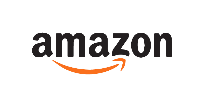
You can explore the Amazon logo, which displays a smiley face arrow from the letter “A” to “Z”. This reveals that they keep a broad range of products and services, from A to Z, and like their clients to be satisfied with their purchasing experience.
Conversely, the Starbucks logo has a stylised siren, which most people call a mermaid with two tails. This well-known logo shows the company’s connections to the sea (where its coffee comes from) and aims to offer customers a still and pleasant environment.
The right colour
Similar to shapes, each colour has its own emotional associations. These significances are typically universal as they are derived from things we observe in the physical world. People feel rushed and on guard when they see red blood. Brown, the colour of trees and wood, makes you assume the country and nature. People all over the world probably assume yellow when they assume the warmth of the sun.
Different cultures associate colours with various meanings, where green symbolises money in the US, while purple conveys negative connotations in Japan.
Colour plays a vital role in shaping how your brand is perceived. It triggers primal reactions and influences emotions. It is one of the most crucial characteristics of a logo. Your suitable logo colour can define the overall impression of your brand. Even in contrast to other elements like shape or typography, colour can significantly impact the perception and reception of your brand identity.
For great branding, the colours in your logo should match those on your website, in-store furniture, staff outfits, and other things.
The right Tone

Different business sectors keep different target customers and places for their brands. Cereal companies often sell to children and families, so they use mascots in their designs to make their products look pleasant and fun. Children are often drawn to bright-coloured cartoons and characters, so this technique works for businesses that want to reach children.
On the other hand, the people who hire law businesses tend to be more serious and professional. They need to develop trust, credibility, and knowledge, so putting a cartoon image in their logo wouldn’t be correct or helpful. Or an endorsement from a playful character, like a cartoon tiger, wouldn’t be well-received by individuals seeking legal assistance, particularly if facing severe legal issues or accusations.
Outline a robust brand strategy and determine who you want to reach to make your logo work well. To whom are you aiming to attract? What kind of companies do they relate to? The answers to these questions will help you pick a logo’s great traits.
Or, if you want a humour approach as part of your branding plan, you can use your logo to remind people of fun.
The logo for MailChimp, an email marketing tool, is a cartoon chimp. The logo is fun and friendly, which fits with MailChimp’s brand tone, known for being easygoing and friendly. By putting a funny mascot in its logo, MailChimp reaches SMEs that want email marketing that is easy to use and fun.
The right typography
The visuals used in a logo can impact the mood and overall impression it gives off. This applies not only to the images but also to the typography used. How your text looks in a logo is just as necessary as what it says regarding how people see your brand.
Typography encompasses a broad range of graphic choices in the text, including font selection, text size, serifs, boldness, weight, format, texture, and even the creative extension of the backside of an ‘L’ (a particular detail that you can creatively extend or modified to visually associate or underline the rest of a word or phrase.) to underline the rest of a word. These elements collectively contribute to the text’s overall design and aesthetic appeal.
Fonts may not have the same direct impact as colours or shapes, but they still stick to identical guidelines. For instance, sharp angles in fonts, like the “M” in Metallica’s logo, convey a sense of edginess and aggression. When selecting fonts, trusting your gut feelings is usually better. However, here are some core basics to help you get started.
- Sans serifs are less formal and more free-flowing, while serifs are finer for more formal or professional companies.
- With all their curves, script typefaces are an excellent choice for high-end and fun names.
You can increase the size of a word, add emphasis, and draw attention to specific aspects of your company or even highlight puns for better impact. This typographic approach effectively conveys your message and forms a visual hierarchy.
- Use different fonts for different styles of text. For example, use a fancy font for your name and a simple, easy-to-read font for supporting text, such as slogans. Fonts that appear hand-written give a friendlier, less professional feel.
When selecting typography, remember to prioritise and follow a logical order. You can focus on the most important aspects before getting caught up in the details. Typography plays an essential role in establishing credibility and readability. Even the most stylish font loses value if it hinders people from reading the text.
The Right trends
You could use the latest logo styles in your design to exhibit how modern and mandatory your business is. You can remain ahead of the curve and use the expertise of innovative creators who explore what’s trendy and what’s not. Trends in design become successful and effective when they are widely adopted and popular among designers and brands. So, creating them is necessary for a successful logo. It will reflect your business’s vitality and up-to-date logo.
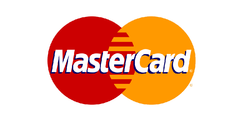
Since 2019, the Mastercard logo has been an easy two-colour overlay of influential circles in red and orange, with no other details or writing. This contemporary and colourful logo is one of the most well-known worldwide. It shows how passionate, energetic, and forward-thinking the business is.
The Right sizes
Use “sizes” instead of “size.” A responsive logo is what advertisers and marketers call the idea of having different versions of your logo. This idea has become more common in recent years. So, you can enhance the size of your logo wherever it shows, from a tiny ad in an app to a massive billboard on the side of the road.
That doesn’t mean you shouldn’t keep different logos, though. Instead, it would help if you had different sizes of the same brand. You can begin with a small and simplified version that retains the essential elements for recognition. As you scale up the logo for larger applications, gradually add more elements, incorporate additional words, and include intricate details to enhance the design. This approach ensures consistency and brand recognition across different sizes while allowing for adaptation to varying display requirements.
We suggest creating four distinct sizes for your logo, but keeping their style consistent is crucial. We don’t force you to do it. But by doing this, you can establish consistency across different sizes. You can enhance brand recognition and avoid diluting the impact of your logo.
Conclusion
The most crucial logo characteristic of all is memorability. The seven items mentioned earlier contribute to creating more memorable logos, ultimately building more robust brand recognition.
If this all appears highly complex for you, don’t fear. You can bypass this and hire the best logo design company in UK to design your logo. You can explain to our designer what logo you want; they’ll take care of the rest. Professionals already explore how to use logo elements to explain the tale of your business.
Moreover, Logo Designs Company UK also offers excellent mobile app development and web design services. You can contact us if you want to develop a website or an app.
