The internet is used by more than 3.5 billion people globally in the digital age. Throughout the last few decades, businesses have had to adjust to this digital transformation, performing the majority of their communications, sales, and proposals online.
Business experts point out that paper mail still has its uses, though! Businesses may easily monitor the success of various marketing tactics through direct mail advertising. Also, physical mail offers a human touch to your organisation that email can’t match when it comes to partners, clients, investors, and customers.
Continue reading to understand how to create custom-branded stationery paper, brochures and banner design in the UK and learn what blunders to watch out for.
Personalised Stationery
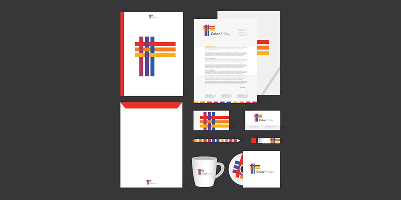

It’s important to never undervalue the value of personalised stationery. Here are some do’s and don’ts you should consider.
-
Implement the Rule of Thirds
Create a grid with nine even boxes when choosing a basic arrangement for your stationery paper. Your design should be divided into thirds to achieve visual harmony and attractiveness.
Choose a choice regarding how your stationery paper will be divided into thirds, vertically or horizontally. Your logo design and contact details should only take up one-third of the paper. You should leave the remaining two-thirds blank to make room for the actual text of your messages and advertisements.
-
The Do’s
Label one of the outside thirds with your logo design and contact details. In other words, the top, bottom, or down either vertical side should all display your brand.
-
The Don’ts
Keep in mind the value of white or empty space. It is advisable to provide a margin of at least 0.5 inches all the way around the personalised stationery.
-
Improve Your Logo Design
Certain logo designs might not look good on stationery paper the way they are. For instance, complex graphic logos look fantastic when they are magnified on a computer screen or larger print advertisement. What transpires when they are reduced to a size of roughly one inch?
Create a companion logo to the one you typically use with a logo builder. You should use some of the same design components and colour schemes as your conventional logo design. In the end, you want to produce a simplified version of your current logo that can still be recognised as a component of your branding.
-
The Do’s
Make sure your logo animation will still be easily recognisable and legible when it is resized to match the header, footer, or border of your stationery paper. Try resizing it on a PDF and printing it if you’re unsure. On your stationery paper, you’ll need a simplified version if you can’t read it or make out the visual elements.
-
Don’ts
Don’t overdo it when redesigning your logo design. It should resemble the one you’ve been using on other marketing collateral as closely as feasible.
-
Think About Color


People frequently believe that neutral or subdued tones are more authoritative. The colour scheme you select for your stationery paper should, however, go well with your branding. In other words, feel free to play with alternative colour schemes if playfulness or distinctive expressiveness are important components of your company’s brand.
-
The Do’s
Experiment with colour if it makes sense for your company. Neutral tones, on the other hand, are your greatest option if your company prefers a classier or more traditional branding design.
-
The Don’ts
Avoid choosing hues that are startling to the eye. Avoid selecting a font colour that is hard to see or that doesn’t stand out against the colour of the paper.
-
Be Sure To Include Envelopes
You’ll also need to get bespoke envelopes when you order custom stationery! Using the Rule of Thirds is still important when creating your envelope. Make sure your brand is noticeable by positioning it in the bottom third or the top left corner above your mailing address.
-
The Do’s
Do your best to match your envelope to your stationery. Ideal materials have a similar stock, texture, and colour.
-
The Don’ts
Avoid using a simple envelope because the recipient might throw it out without knowing what’s inside. Your letters shouldn’t appear to be junk mail, please!
Brochures


A firm shouldn’t undervalue the advantages of printed media when promoting a good or a service. A corporation can highlight the advantages of a product or service or showcase products in the best way possible with the aid of the appropriate brochure.
Businesses who want to get the most out of their brochure design should think about the dos and don’ts in advance.
Do’s
The following is a list of some of the most important things to take into consideration, although each firm will have its own specific needs when it comes to brochure design.
-
Make a Beautiful Design
Many companies can neglect the value of design in favour of content, but the brochure needs to grab the reader’s attention. As a result, the brochure design company should needs to do something really eye-catching without detracting from the brand.
-
Think About Printing
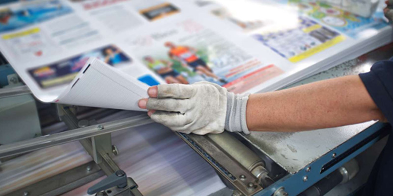

Businesses shouldn’t ignore file size while designing brochures. A minor error might cause the final design to appear pixelated, which would give it an unprofessional appearance and put readers off. It is crucial to validate the dimensions before spending time on the design since otherwise, the procedure can take longer than it needs to.
-
Using Examples
The brain can digest graphics 60,000 times faster than text, which may surprise some people. Although while photos cannot, by themselves, convey all of the information, they should nevertheless be used in brochure design.
They not only add visual interest but also serve to break up the content, keeping the reader’s focus on the brochure design.
Don’ts
In addition to the procedures that must be followed while designing brochures, certain techniques must be avoided if perfection is the goal. If a company’s brochure design hasn’t had the desired effect in the past, it could be wise to think about the following “don’ts.”
-
Overuse of Information
The design of a brochure must contain a lot of information. Otherwise, the intended audience might not be aware of the message. Nonetheless, it is vital that a company avoids inundating customers with information.
Depending on the sort of brochure being developed, the quantity of information it contains might vary, but in most cases, it should include a headline, contact information, brand aspects, a call to action, and pictures.
-
Overuse of Fonts
Many businesses use a variety of typefaces to catch readers’ attention in an effort to separate out from the competition, but employing too many fonts might make the text appear cold. While using multiple typefaces is fine, it should be kept to one or two. Also, businesses must make sure that the fonts are readable.
-
Be Like Your Competitors


When a rival’s printed materials are successful, it can be alluring for others to emulate the strategy. Although reasonable, selecting a design that is similar to the competition could, at best, lead to misunderstanding or, at worst, give the impression that the company is a fraud.
The organisation can design an appealing brochure as long as it stays true to the brand and is well aware of the business goals.
Crucial Dos and Don’ts Banners
If you want to draw in new consumers from across the street or the exhibit floor, having a pull-up banner at your upcoming trade show or just stationed near your business is a need. You may certainly employ a variety of other marketing strategies to draw in more clients or advertise your goods or services, but nothing compares to the impact of a bespoke pull-up banner design in the UK.
A retractable banner design disaster can be avoided, but there are several dos and don’ts to keep in mind;
Do’s
-
Choose the Proper Image Size
Making sure the image is large enough and has a resolution of at least 150+ dots per inch is the key to selecting the ideal image (often seen as either DPI or PPI). Smaller images will distort and provide a terrible banner appearance. Keep in mind that for your pull-up banner design, bigger is better.
-
Put the Most Crucial Information at Eye Level
Eye level is where reading is most convenient for the eyes to travel naturally. So, you must make sure that the most crucial text or image is positioned above the centre line or at eye level.
-
Choose Your Words Carefully
Selecting the appropriate wording for your pull-up banner could mean the difference between a profitable advertisement and a total financial waste. The headline must be large and prominent and contain only the essential details that will catch the reader’s attention. Write in simple terms and as though you were conversing to your reader.
Don’ts
-
Decide That “Cheaper Is Better”
Yet, you don’t always have to spend more money to get quality; cheaper isn’t always better. Whether you intend to use your pull up banner indoors or outdoors, you do need to make sure the material is appropriate for your needs. Each environment will be catered for by the material utilised.
-
Don’t Worry About More Advertising
Always keep in mind other marketing materials that will be distributed while standing by your banner, especially at events like trade exhibitions. Examples include brochure designs or sticker printing. Even though your display will be accompanied by a pull-up banner, you still need to succeed with your marketing strategies by “hooking your bait” even more while the chance is still there.
Conclusion
Why not the set of your marketing strategy when you want every area of your business to be unique? Ignoring the value of personalised stationery design, banners, and brochures are some key chances of brand identification. Because not all companies choose custom stationery designs, choosing it has added benefits for you. You cannot dispute the fact that it will give off a polished, business appearance. Having the business card’s logo printed on it might increase trustworthiness. However, if you are looking for personalised stationery with logo animation in the UK, then get in touch with LogoDesignsCompany.


