
How can you persuade people to invest their time on your landing page? In an age where our digital lives are a constant swirl of notifications and distractions, convincing individuals to spend their precious time on your landing page is the cornerstone of online success.
Knowing what makes a fine landing page helps improve your landing page game. Today, LDC, the web and mobile app development company, will talk about the top 10 firms’ best landing pages. Reading this blog will enable you to look at them and create ideas for your own business.
Shopify
Like most landing pages in this post, the trial landing page for Shopify sellers is straightforward. Even though it doesn’t have huge content, it still persuades individuals to purchase its great product by pointing out key features like easy store setup, solid payment process, and built-in SEO. When people leave, they know that Shopify is a trustworthy, easy-to-use platform that has everything you require in one place.
Why Does Their Landing Page Have a Good Impression on Clients?
- Clean Interface: The page uses simple pictures and short phrases to explain the details and benefits of the trial. For example, the user-friendly headline is simply a short-word sentence.
- Short CTA: Only a few forms you must fill out before you move on. The page is stress-free for clients to use their site to sell online immediately.
Great Jones
During the pandemic, many of us have cooked a lot more and tried to improve our cooking tools. The main page that Great Jones shows is merely as lovely as its Dutch ovens. It fits our dreams of the perfect kitchen and makes us want to improve.
Why Does Their Landing Page Have a Good Impression on Clients?
- Use of Colour: The website for Great Jones is multicoloured, simply like its kitchenware. The bright colours make the cookware stand out and quickly draw people in.
- Prominent CTA: You can’t ignore the bright yellow CTA. It offers a $100 savings. Who wouldn’t want to get these beautiful pots for $100 less?
Muzzle
The main page of Muzzle, a Mac app that mutes on-screen notifications, follows this “show, don’t tell” policy to the letter. Landing pages play a vital role in supporting individuals to assess whether your product or service is a valuable investment of their time and energy. What better way to quickly and clearly explain your value proposition than to show people the problem your software solves?
Why Does Their Landing Page Have a Good Impression on Clients?
- Show Instead of Tell: Many embarrassing messages pop up quickly in the top left corner of the screen when people go to the page. The video is not only funny, but it also shows how useful the app is without using many words.
- Cohesive Visual Experience: The page’s font colour is a tasteful shade of grey that entirely serves the product’s goal.
DoorDash

DoorDash is an app that allows you to purchase food from several eateries on your smartphone. Fans of takeaways probably already know about it. On the other hand, this home page is for Dashers, the people who do the deliveries, and not for customers.
Why Does Their Landing Page Have a Good Impression on Clients?
- Emphasises Dasher Autonomy: This home page makes a big deal out of how independent and adaptable Dashers are.
- Highlight Earning Opportunities: Although you cannot prove these earnings as standard, they attract individuals seeking handsome income.
Wise
The sign-up landing page has CTAs to give money, get money, and use a bank card.
Wise divides its users into two groups on the front page: Business and Personal. This way, you will be clear of choices that don’t apply to you. With Wise, you can give or receive cash in multiple currencies and countries. Even a short movie shows people how the service works before they use it. Because money is at stake, the first time a customer comes in, it must be perfect.
Why Does Their Landing Page Have a Good Impression on Clients?
- Highlight Safety: Wise is a safe way to give and receive money because security information is displayed clearly on the website, putting any worries a potential customer might have to rest.
- Focus Value: Throughout the text and video on the page, Wise points out how much cheaper it is to send money with Wise than with a regular bank.
Airbnb
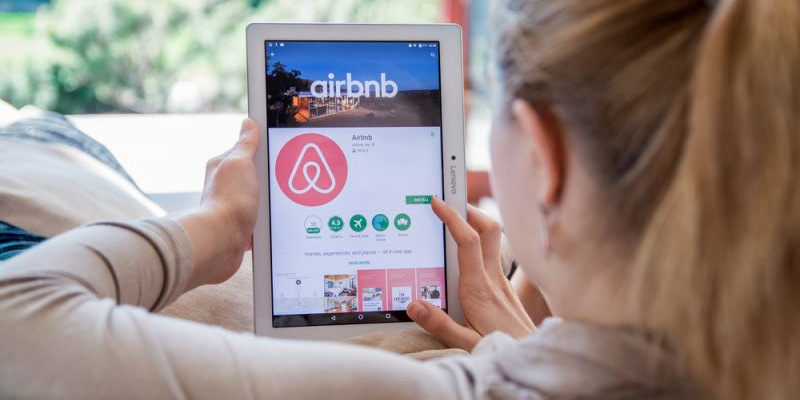
Airbnb support to get guests to become hosts is its appealing personalisation: An estimate of how much money you can expect to make each week based on your location and house size. To get a more personalised quote, fill in the blanks with more information about where to stay.
The second example of an Airbnb to the page already sure you want to buy; the prominent call-to-action makes it easy to do so right away.
Why Does Their Landing Page Have a Good Impression on Clients?
- Personalisation: As a first-time Airbnb host, you will be informed of the possible earnings per location and home size. This feature is handy for new hosts who are unsure about how much to charge or how much they can earn.
- Leverage Community: When more down the page, you can find a way to talk to an expert Superhost about any questions you have about hosting.
Wag!
Through the Wag! Service, dog owners, and people who walk and care for dogs can meet. The Wag landing page gets to the point and tries to get people to sign up. There is a form that is visible on the right side. The green background makes the white text and other parts of the site pop out. It’s also nice to put a QR code on the form so people can sign up and get the app immediately by scanning it.
Why Does Their Landing Page Have a Good Impression on Clients?
- Efficient Forms: If the form field is left open on the page, visitors won’t have to click on a CTA to get to it. The QR number speeds up the process even more.
- Focus on credibility: Wag is more dependable because it has pictures of caretakers, and more than 351,000 caretakers use the service nationwide.
Unlock your digital potential today! Get in touch for modern logo design, exceptional web design services, and cutting-edge mobile app development. Let’s create something extraordinary together!
Wistia
You foremost witness the blue background and pink “Try for free” buttons. The website reaches into action with a movie displaying all the calm things you can do. If you require more clarification, scroll down to notice what some of Wistia’s 375,000 satisfied clients have to say.
Why Does Their Landing Page Have a Good Impression on Clients?
- Ease of Use: You can connect the form to their Google account and fill it out fast. Clients can turn on the autofill tool, which makes it easier for the user.
- Capitalises on Visuals: Wista uses various media to show its usefulness as a video host. There are animated films, colourful images, and a connection to marketing-themed cartoons.
Webflow
Webflow is a design tool for web writers. It lets a lot of data fit into just a single GIF. Like Muzzle, Webflow spends less time describing what its technology can do. Instead, it demonstrates how it performs. Because the playful animated GIF is in the exact frame on the website, users can explore how the product performs and sign up without moving.
Why Does Their Landing Page Have a Good Impression on Clients?
- Don’t tell, but show: People who want to buy the gadget can see it in motion to get a good idea of what it does and how it works before they buy it.
- Removes risk: Visitors learned about the free service in multiple places on the landing page. No trial sign-up is allowed. When you are prepared to begin, you can create their site for free and choose whether to pay for a plan.
Talkspace

Talkspace is an online counselling service focusing on dependability on its home page. Customers will have access to approved therapists, and the security and privacy of the service are stressed all over this website. It’s a fantastic way to promote people who are doubtful to join. The use of forms is another good idea. Because pages are usually full of squares and boxes, putting the CTA in a big circle immediately draws attention. The style, as a whole, is clean, friendly, and educational.
Why Does Their Landing Page Have a Good Impression on Clients?
- Builds more trust: Since they follow HIPPA rules, their focus on client security is good.
- Contributes Value: landing page has multiple articles and links about mental health and details about how Talkspace works.
Conclusion
Operating landing pages can be beneficial in attracting better customers and expanding sales. To confirm customer loyalty, create a website with a satisfactory user experience to boost repeat visits with a strong landing page.
Will you strengthen your brand digitally with a unique landing page? If yes, we are here for you!
Get an engaging logo designor visually appealing web design services to meet your expectations. Contact our mobile app development company now to discuss your project. Get the help you need to craft an appealing landing page.