Brochure design trends come and go every year, just like other graphic designing things like logo designs, websites, business cards, etc. The drive to attract potential customers and regular customers is constant for marketers.
This compels them to create brochures and other advertising materials that stand out. As a result, fresh design fads emerge annually to provide unique brochure designs. Logo Design Company in the UK and Europe is trying its best to bring a completely new creativity to market.
In essence, a design trend is an effort to draw attention to a certain design. But selecting a specific trend has this fundamental purpose. Making a business or corporation stand out is one of the main goals of using a certain process to generate fresh designs. According to Statista, demonstrates the extent to which small- to medium-sized businesses use flyers, brochures, or business cards for marketing purposes.
In any particular industry, there are thousands of brochures available. How might the design of your brochure draw readers in? That is the whole point of using an online brochure template to create a brochure in the first place.
A design trend aids in producing some exceptional designs, including brochures, because it introduces new methods to use colours and other aspects.
Here Are Some Significant Changes in Brochure Designs That We May See
-
An Extensive Range of Typography
When it comes to using several typefaces, the designers can try out a lot of different things. It should be mentioned that an increasing number of firms are creating their own bespoke typeface.
In 2023, the majority of designers won’t adhere to a predetermined typographic style. Bold typefaces have traditionally been used to draw buyers’ attention. But now it seems likely that the designers will use a variety of typefaces. They can add various typographic characteristics to a brochure or banner design. This implies that bold typefaces may be used on the front cover of different brochure sizes.
It’s possible that the cover uses more than one typeface. The headings, subheadings, and body text in a brochure’s inner folds will all be in a separate typeface.
-
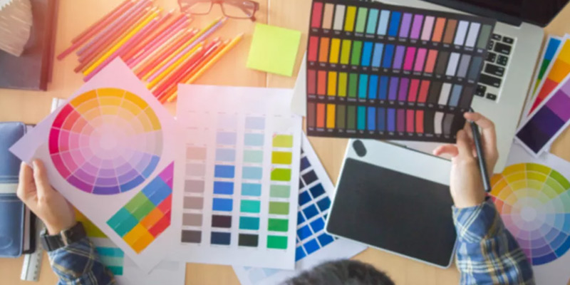
Utilisation of Bold Colors

Designers have up until this point, relied on muted, subdued hues. They believed that using dark colours would communicate a brand’s elegance.
However, this is presently altering. It’s probable that the designers of brochures will choose vivid and bright colours. They are able to use colour patterns and gradients.
Many brochure designs might be replicated as part of a company’s rebranding effort. Therefore, it is likely that brochures would use a variety of vibrant hues. Here, the idea is to use something fresh to draw in prospective hues.
We can anticipate the return of colour gradients in place of the employment of plain, monochromatic hues. The designers will occasionally mix dusty pastels and muted colours in with bold and saturated hues.
-
Keeping Off the Grid
More and more designers of brochures want to deviate from the norm. Therefore, it’s possible that they are not utilising the design grids as advised. They appear more focused on disrupting the grid.
The best logo design company designers rigorously adhere to the rule of making excellent use of the grids while creating logo designs and other graphic designs.
However, the graphic designers would prefer to do away with the grids in their pursuit of distinctive appearing brochure designs. This will allow them to explore freely when choosing a layout for the brochure’s interior pages and cover. As a result, you should be prepared for even oddly designed pamphlets that you may have never seen before.
-
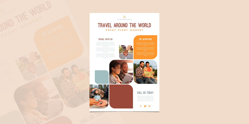
Various Geometric Shapes


Designers of brochures will experiment with a variety of geometrical forms. You may encounter pamphlets in odd shapes, including triangle-shaped brochures.
Square and rectangular shapes are prevalent everywhere. If you receive some circular pamphlets, don’t be shocked. However, these remain the fundamental shapes.
Additionally, brochure designs may be made in the eight-sided (octagon) or six-sided (hexagon) formats. The goal of all these experiments is to astound a target audience with graphic design services. Designs for brochures will stick out thanks to their peculiar shapes.
-
Employing Illustrations
Illustrations always stand out and immediately grab the viewer’s attention. When a designer uses illustration as a technique to spread a marketing message, they may guarantee artistically sound works of art. When incorporating some illustrations, there is a certain amount of raw inventiveness.
Brochure designs in 2023 will make use of a range of illustrations. The use of this component in the creation of a brochure serves the objective of improving audience contact.
Illustration, in the opinion of the designers, is a good alternative to photographs. Images of goods or services in a brochure have been a terrific way to convey information. However, to shake things up and surprise the customers, an image will be utilised to depict a business’s operations.
-
Contemporary Brochures


The majority of designers choose the minimalist design trend. According to this design philosophy, only necessary design elements are used to communicate a brand message. This is a result of the focus being more on producing a straightforward design that people can comprehend right away.
Therefore, many designers will develop design concepts for brochures that use fewer design elements.
Existing brochures set out the name and purpose of the company in one colour in the backdrop and one small typeface in the foreground.
Many graphic designs, including those for social media pages, already use minimalist design.
-
Brochures in 3D
Traditional brochure designs are two dimensional. The third dimension will now also be explored by brochure designers. Such brochures will make an effort to convey a sense of depth in their design.
Bright colours will be employed to create the appearance of depth in these brochures. The majority of these brochures will resemble works of art.
-
Using Creative Photography


In order for a brochure to be successful, images are crucial. Conventional, amateurish, or unqualified visuals cannot successfully communicate a message. Such pictures have a highly formal, motionless aspect. Designers of brochures are more likely to incorporate creative images.
Professional photographers who understand how to effectively interact with viewers make these pictures. This year, there has been an increase in the use of artistic photography.
Conclusion
The use of a variety of typefaces, and brilliant colours, avoiding the use of grids, geometric forms, animated retro, and colourful fonts are among the brochure design trends for 2023. These aesthetic components and design trends will aid in producing distinctive brochures that stand out. If you are looking for the top brochure design company for unique and creative website design brochures, get in touch with our Logo Design Company.


