Traditional brochures are evolving into stunning pieces of art that captivate audiences, stimulate action, and make an enduring impact in today’s fast-paced and visually-driven society. Brochures are embracing various unique trends to attract readers and improve brand experiences due to technological improvements and a rising emphasis on sustainability and creativity.
The field of brochure design in the UK is reviving, with bespoke artwork, interactive components like QR codes, and augmented reality all appearing. Geometric designs, bold colour schemes, and retro inspirations greatly influence the development of visually arresting and memorable brochures. Dynamic layouts, unique die-cuts, and 3D effects offer a tactile and interactive experience. At the same time, microcopy and aesthetic aspects meet the needs of contemporary readers for compelling content.
In this article, our best logo design company in the UK looks into these fascinating developments and considers how they can change the value of brochure design. Let’s delve into the world of interactive aspects, sustainable practices, unique images, and more, whether you’re a marketer, designer, or simply passionate about appealing print materials.
Interactive Elements


Technology improvements enable the integration of interactive elements like QR codes, augmented reality (AR), and embedded films into brochures. These characteristics make reading exciting and give readers a dynamic, immersive experience.
Picture yourself leafing through a brochure and coming across a QR code that starts a movie displaying the product in use when scanned with a smartphone.
You can have brochures with augmented reality (AR) components, enabling customers to use mobile devices to overlay digital content on printed pages. An AR element, for instance, in a travel brochure, allows readers to visually explore well-known locations or see 360-degree views of hotel rooms.
Sustainable Materials


You can use sustainable materials in brochure design due to environmental awareness. Recycling paper, using eco-friendly inks, and using simple packaging all help to promote a better environmentally responsible strategy.
Imagine a brochure with text and photographs printed on high-quality recycled paper and inks from vegetable-based dyes. Go for a basic packaging design, such as a booklet, to prevent using too much plastic or non-recyclable materials. These eco-friendly decisions show a company’s dedication to the environment and appeal to customers who value environmental awareness.
Custom Illustrations
Hand-drawn pictures and original visuals give brochures a unique and tailored touch. The brand stands out from rivals thanks to the authenticity and individuality these illustrations convey.
You can use hand-drawn pictures of the farm’s green fields, ripe vegetables, and content animals in a brochure to advertise a nearby farm-to-table restaurant. By capturing the soul of the brand and exuding an air of authenticity, these personalised visuals give the content a unique and aesthetic touch. Carefully create each illustration to reflect the distinct character and values of the company to differentiate it from generic product pictures.
Geometric Shapes And Patterns


Designing brochures with geometric patterns and shapes offers visual structure. Geometric Shapes and Patterns provide a contemporary and opulent look while fostering a sense of balance and harmony.
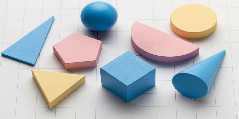
Look at a brochure for a modern art gallery that uses geometric shapes and crisp lines in its design. The brochure uses triangles, circles, and squares to draw the reader’s attention and provide visual interest. Using geometric patterns as borders or background elements can add fascinating graphical structure and a modern vibe to the entire design.
Vibrant Colour Palettes


The design of brochures is becoming more popular with bold and colourful colour choices. Going for vibrant and alive colours draws the eye, elicits solid feelings, and gives readers a fascinating visual experience.
Imagine a brochure promoting a music festival filled with vivid, intense colours. The colour scheme uses vibrant tones like electric blue, vivid orange, and hot pink. These vibrant hues represent the upbeat atmosphere of the event. It not only draws attention but also elicits emotions and excitement. The reader’s experience can be visually engaging and memorable by choosing complementary and contrasting colours.
Retro And Vintage Inspirations
The design of brochures revives retro and nostalgic design features. Vintage-inspired artwork, distressed textures, and retro font offer a feeling of charm and authenticity while evoking nostalgia.
Consider a brochure for a boutique clothes shop from a 1960s style. The typography chosen resembles vintage fonts from that period, and the brochure design includes worn textures to give it a vintage vibe. Illustrations with a vintage feel can show off vintage clothing or fashion icons with a captivating and reflective element (vintage-inspired illustrations) that fits the store’s brand.
Dynamic Layouts
Brochures embrace dynamic and unorthodox arrangements rather than typical, static formats. You can grasp the reader’s attention by integrating asymmetrical compositions, overlapping parts, and inventive grid usage, providing visual appeal and excluding dullness.
Look at a brochure for a modern art show with an asymmetrical design with overlapping parts. The composition departs from the conventional grid structure, creating a captivating and visually appealing design. To direct the reader’s eye and give the brochure a sense of movement and energy, the items on the page can overlap or intersect.
Custom Die-Cuts And Folds
Your brochures can have complicated folds and unusual die-cut shapes to make them aesthetically appealing. Unusual formats and engaging folding strategies captivate the reader, leaving a lasting impact.
Imagine a brochure for a high-end automaker that has a distinctive die-cut design. The brochure can be aerodynamically smooth with curved edges or cutouts that mirror the car’s shape. Complex folds reveal diverse information or parts as the reader unfolds the brochure, making for a memorable and engaging experience.
Are you looking for the best logo design company in the UK? Use our skilled logo design services today to get the best animated logo, attractive brochure, stationery, and website design services!
3D And Depth Effects
Thanks to printing and design technology developments, brochure design can now incorporate 3D and depth effects. You can enhance the overall quality of the brochure by integrating tactile and eye-catching effects using embossing, debossing, and layered graphics.
Think about a brochure showcasing a brand-new cosmetics line. The brochure displays the product packaging using embossing and debossing techniques, with raised or recessed sections giving the reader a tactile sensation. Layered designs could give depth and dimension, giving the goods a more realistic appearance and improving the brochure’s overall visual impact.
Artistic And Abstract Elements
Brochure design promotes creativity and originality by having artistic and abstract features. You can build an eye-catching and distinctive look using abstract images, brushstrokes, and experimental designs.
Consider a brochure for an avant-garde gallery that uses avant-garde visuals and abstract imagery. The brochure uses vigorous brushstrokes, bursts of vivid colour, or geometric forms grouped unconventionally. These artistic components provide a dash of originality and curiosity, reflecting the avant-garde ethos of the gallery.
Snackable Content And Microcopy
Brochures use snackable material and microcopy to adapt to readers’ decreasing attention spans. Using these, you can efficiently communicate critical points to the viewers and entice them to investigate more by concisely writing via eye-catching graphics.
Take a look at a travel guide for a busy city. The brochure highlights important attractions using microcopy rather than lengthy paragraphs, such as “Stunning Skyline Views” or “Foodie Paradise.” You can complement each information fragment with eye-catching images that help readers rapidly understand the key points and entice them to read more.
Social Media Integration
You can integrate Social media into brochures. You can connect with readers online and encourage more connection and engagement by including QR codes, hashtags, and social media handles.
Look at a brochure that uses social media. The brochure includes QR codes that, when scanned, take readers to the event’s social media pages, where they find out more details, participate in conversations, or express their excitement by using hashtags relevant to the event. Through better interactivity and an increase in the event’s reach on social media platforms, this integration helps close the gap between the physical brochure and the online presence.
Conclusion
In conclusion, incorporating these trends into your brochure design can take it to new heights. Your brochures will engage readers and create a lasting impression if you incorporate interactive elements, environmentally friendly strategies, distinctive graphics, and creative design.
So contact us to explore these changing trends from our top brochure designer to make effective brochures stand out in the crowded market soon. So, make the most of the opportunities, inject creativity, and produce brochures that excite, engage, and deepen your audience connections.
Besides brochure design, we offer animated logos, website design, and logo design services in the UK.
Don’t wait and grasp the opportunity now. Make your marketing strategy via brochures extraordinarily unique and appealing.
Also Read: Why are opting for logo design services better than freelancers


